Munchkin Grass Fed
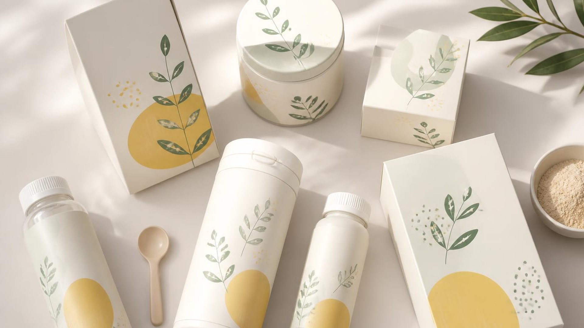
Speak to parents like adults and the shelf gets quieter, calmer and far more convincing.
An identity for a children's nutrition line that trusts parents instead of talking down to them.
Most of the category leans on cartoon mascots and primary colours. We took the opposite route: a calm palette, generous white space and a wordmark with enough warmth to feel human without becoming childish.
The system runs on a strict information hierarchy — sourcing first, nutrition second, flavour third — because that is the order parents actually read in the aisle.
Every asset was drawn from one grid, which made the range straightforward to extend as new formats shipped through the following year.
- Client
Munchkin
- Year
2022
- Role
Creative Director
- Services
Brand Identity
Packaging
Design System